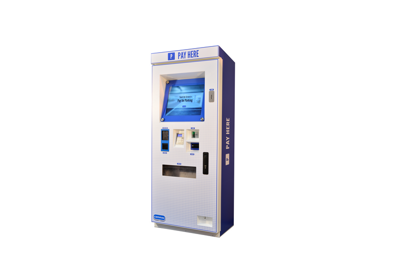
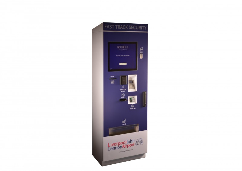
More and more businesses are realising the potential of kiosks and with new solutions in payment, retail and ticketing being developed all the time, a plethora of sectors are now reaping the rewards.
Interactive kiosks come in an array of different designs and with many purposes in mind. You might also be surprised to learn that the type of touch screen you choose can also have far-reaching implications as far as the success of your new kiosk project goes.
So. if you’re a business looking for a robust yet user-friendly solution, or if you’re an organisation looking to project a message that stands out from the crowd, read on to find out whether or not a vertical or angled touchscreen would work best for you.

Angled Touch Screen Pros:
Firstly, angled touchscreens tend to be less visually obtrusive than vertical touch screens because the screen doesn’t directly align with the user’s face.
Angled screens spread their surface area across both the vertical and horizontal plane, creating a shorter and more compact kiosk that doesn’t detract too much from the view ahead.
If users are likely to spend lengthy periods viewing information on the kiosk then it’s generally recommended that angled touch screens are the best option. Consuming large amounts of information over lengthy spells facing a vertical kiosk could lead to potentially unpleasant side effects like upper body and neck strain.
Further, some kiosks, like those in our outdoor range, have an angled screen within an enclosure with sides (similar to a cashpoint). This measure is put in place for extra privacy, protecting the user and making it more difficult for “shoulder surfers” to see what is on the screen.
Angled Touch Screen Cons:
Because angled screens are designed to reduce visual obstruction, it also means that they are not as recognisable from long distances. If you are planning on deploying a kiosk in a congested public location then the kiosk really needs to stand out to grab attention so opting for an angled screen might not be the wisest option.

Vertical Touch Screen Pros:
Generally speaking, vertical touch screens eliminate the majority of cons associated with the angled version. Vertical screens stand upright and thus can be placed flush against a wall without consuming much space at all. Also, they are generally easier to see from distance because the screen is in plainer view.
Users find it easier to consume information whilst reading on the go and, as text becomes angled, it simultaneously becomes more distorted and harder for the brain to compute. Admittedly, if the user has time, this issue isn’t prominent but if your aim it to push a simple and effective message then you may want to keep this information in mind.
Vertical Touch Screen Cons:
As already alluded to, vertical touch screens could be inappropriate for significantly prolonged usage.
Choosing the right touch screen kiosk
To summarize, when users require access to lots of information, i.e. at libraries, museums or other public buildings, it may be advantageous to opt for angled touch screens. The screen can be conveniently placed without distracting visitors too much and this move can improve the overall experience.
However, in more crowded environments where users need immediate access to tickets, products or information, vertical touch screens should be employed.